SYMBOL MARK
DAEBO's word mark is composed of an oval, which symbolizes prosperity, infinite creation, and unity, and two dynamic lines
which resembles
alphabet letters D and B. The oval expresses the company's gentleness
and stability while the two dynamic,
modern lines show our adventurous, enterprising spirit as well as future-oriented attitudes.
CI COLORS
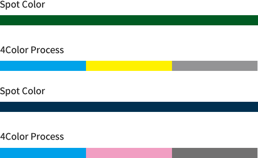
Along with the symbol mark,
the CI colors of DAEBO Group,
carefully chosen for the corporate image,
is a key element of our CI communication.- In principle, four primary colors should be used for printing, but application of a spot color may be allowed depending on the medium used.
Color reproduction may be subject to slight variation depending on the property of a medium, but efforts shall be made in order to replicate the colors provided above.
-
greenSpot Color PANTONE 3537C 4 primary colors C95% + Y100% + K55% RGB R0 + G91 + B35
-
blueSpot Color PANTONE 540C 4 primary colors C100% + M50% + K70% RGB R0 + G48 + B80
The green color, representing nature and life, expresses the reliability of the company.